Table of Contents
- Introduction
- The Importance of Dark Mode
- Understanding CSS Custom Properties
- Setting Up Your Base Theme
- Handling User Preferences
- Building the Theme Toggle
- Persisting User Choices
- Managing Color Contrast and Accessibility
- Testing for Visual Consistency
- Handling Images and Media
- Advanced Implementation Patterns
- Common Pitfalls to Avoid
- Best Practices for 2026
- Conclusion
Introduction
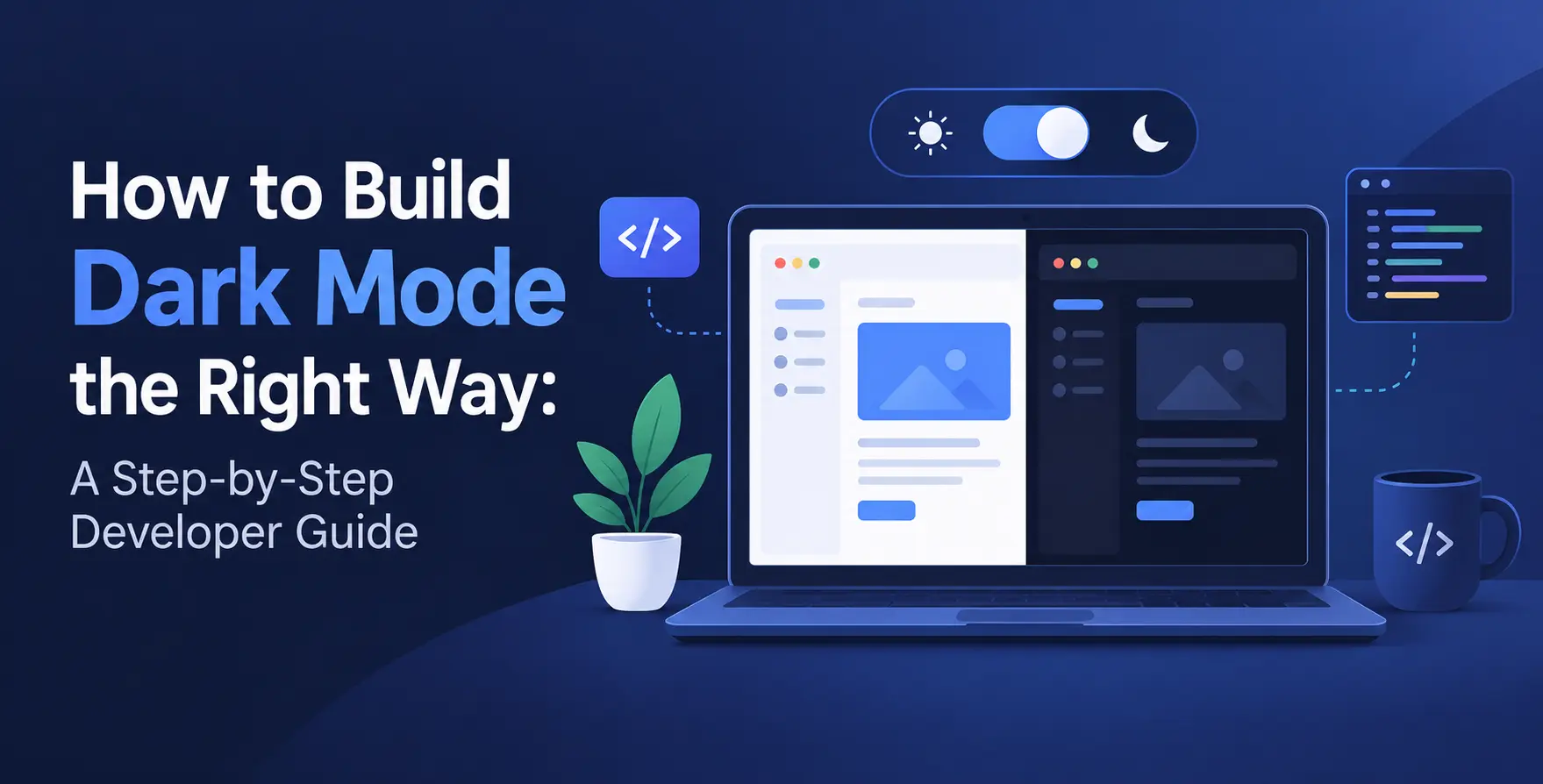
Modern web interfaces demand flexibility to suit diverse lighting conditions and user preferences. Implementing a robust dark mode is no longer a luxury but a standard requirement for high-quality web development.
A well-executed theme switch improves readability and reduces eye strain for users browsing in low-light environments. This guide breaks down the technical steps to ensure your implementation is performant and maintainable.
The Importance of Dark Mode
Users often prefer dark interfaces during evening hours or within dimly lit workspaces. Providing a choice directly impacts engagement and usability metrics across your entire platform.
Strategic dark mode implementation helps your site feel modern and considerate of user needs. A thoughtful design approach aligns with broader UI UX design benefits that drive retention.
- Reduces digital eye strain
- Conserves battery on OLED screens
- Enhances visual comfort at night
- Shows attention to accessibility
- Improves overall user satisfaction
Understanding CSS Custom Properties
CSS variables are the backbone of a successful dark mode website design. By defining colors as custom properties, you decouple your style definitions from the actual color values.
This allows you to swap themes instantly by updating a single container class or data attribute. It is the cleanest way to manage complex color palettes without repeating declarations.
Benefits of Custom Properties
Using variables makes your theme system scalable and much easier to debug during development. You avoid the nightmare of searching through hundreds of lines of code to find hardcoded hex values.
- Centralized color management
- Dynamic style updates
- Improved code readability
- Easier maintenance cycles
- Consistent design tokens
Implementing Scoped Variables
You define your colors inside the :root pseudo-class for light mode. When the theme changes, you simply override these variables within a specific class like .dark-theme or [data-theme='dark'].
- Define light mode variables
- Override in dark context
- Use variables in components
Setting Up Your Base Theme
Start by creating a structured theme map that covers every element of your design. You need to define background colors, text colors, borders, and accent shades for both modes.
Organize these tokens logically so that you can easily map them to your components. Avoid mixing logic with presentation by keeping these definitions in a single configuration file.
| Element |
Light Mode Value |
Dark Mode Value |
| Background |
#ffffff |
#121212 |
| Primary Text |
#212121 |
#e0e0e0 |
| Secondary Text |
#757575 |
#a0a0a0 |
| Border |
#e0e0e0 |
#333333 |
| Action Button |
#007bff |
#0056b3 |
Handling User Preferences
The operating system often dictates whether a user prefers light or dark interfaces. Use the prefers-color-scheme media query to respect these system settings automatically.
This provides a seamless experience for visitors landing on your site for the first time. They should not have to manually toggle a switch if their computer is already set to dark mode.
- Detect OS preferences
- Apply initial theme
- Allow manual override
- Provide fallback defaults
Building the Theme Toggle
A manual toggle allows users to override the system setting based on their immediate needs. Use a simple button component that updates a data attribute on the document element.
Ensure the toggle is accessible and provides clear feedback about the current state. Even if you use a framework, this logic should remain clean and predictable.
- Create a switch button
- Listen for click events
- Update data attributes
- Toggle classes dynamically
Persisting User Choices
Once a user selects a preference, you must save it so the site remembers their choice on subsequent visits. LocalStorage is perfect for storing these small user-defined settings.
Check for a stored value when the page initializes before applying system-level logic. This ensures that the user's explicit choice is always honored over general defaults.
Managing Color Contrast and Accessibility
Accessible web design requires careful attention to contrast ratios regardless of the theme. Dark mode is notorious for making low-contrast text nearly invisible if you are not careful.
Always test your color combinations against WCAG accessibility guidelines to ensure usability. Never assume that a color that looks good in light mode will automatically work in dark mode.
- Maintain 4.5:1 contrast
- Verify color accessibility
- Use readable font weights
- Test on mobile screens
- Check focus indicators
Handling Images and Media
Images can sometimes be jarring when they appear as bright white blocks in a dark interface. Consider using CSS filters or providing alternative versions for dark mode assets.
Sometimes a simple opacity adjustment or a slight brightness decrease is enough to soften the impact. Test every media element to ensure it fits the visual tone of your site.
Advanced Implementation Patterns
If you are building complex applications, consider using a theme provider wrapper. This is common in modern frontend development where state management becomes critical for UI consistency.
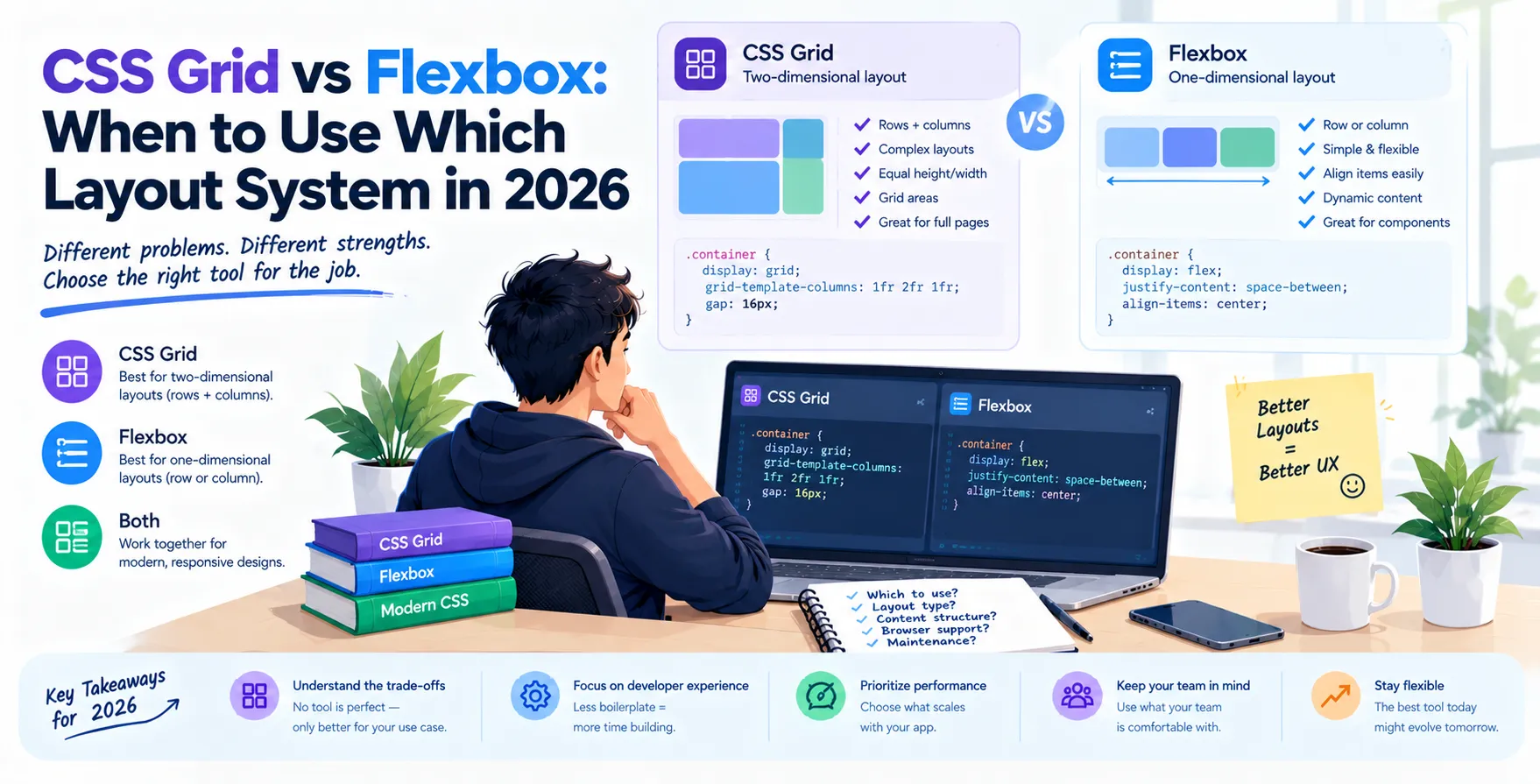
You can also use CSS Grid vs Flexbox to ensure your layout adapts perfectly to different component sizes. Maintaining a responsive design is just as important as the colors themselves.
Common Pitfalls to Avoid
Many developers fail by simply inverting colors using a blanket CSS filter. This approach often ruins icons, images, and brand-specific accent colors.
Another common mistake is creating themes that look flat or lack depth. Even in dark mode, you should use elevation and subtle surface changes to indicate hierarchy.
- Avoid full color inversion
- Prevent layout shifts
- Do not ignore borders
- Check hover states
- Verify high-contrast mode
Best Practices for 2026
As we move further into the future of frontend development, user-centric design remains king. Your dark mode should feel like a native part of your brand identity rather than an afterthought.
Consider how custom web components can help you ship consistent UI across your application. Using a structured approach ensures your code remains clean, testable, and highly performant for every visitor.
Conclusion
Building a great dark mode is about precision and user empathy. By using CSS custom properties and respecting system preferences, you create a polished experience that users truly appreciate.
Keep your color palettes accessible and test your implementation across all device types. When done correctly, your dark mode will enhance your overall design and keep users engaged for much longer.


 In collaboration with