Table of Contents
- Introduction to Modern CSS Layouts
- Understanding the Core Differences
- When to Use Flexbox
- When to Use CSS Grid
- Comparing Layout Philosophies
- Flexbox Use Cases
- CSS Grid Use Cases
- Combining Both Systems
- Responsive Design Considerations
- Performance Impacts on UI
- Accessibility in Layout Design
- Future of CSS Layouts
- Common Implementation Pitfalls
- Conclusion
Introduction to Modern CSS Layouts
Web development has evolved significantly over the past decade. We moved from float-based hacks to robust, native layout engines that handle complex UI requirements with ease.
Today, developers must master the nuances of layout tools to build efficient and scalable interfaces. Knowing when to choose CSS Grid vs Flexbox is a fundamental skill for any senior engineer.
Understanding the Core Differences
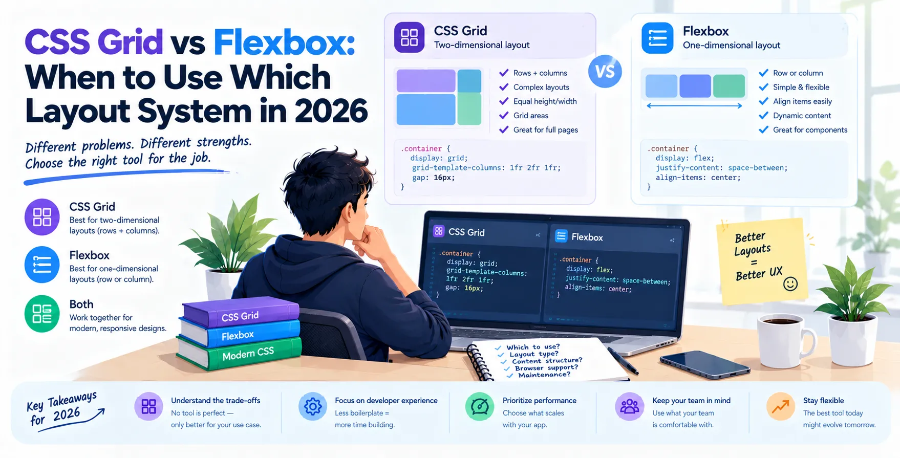
The primary distinction lies in how these systems handle dimensional space. Flexbox is fundamentally a one-dimensional layout model, designed to manage items in either a row or a column.
In contrast, CSS Grid provides a two-dimensional layout system. It allows you to align items in both rows and columns simultaneously, making it ideal for complex page architectures.
You should view them as complementary tools rather than competing alternatives. Understanding their strengths ensures you write cleaner, more maintainable code.
- Flexbox manages single-axis alignment
- CSS Grid handles multi-axis layout grids
- Flexbox excels at content-driven sizes
- CSS Grid excels at container-driven structures
When to Use Flexbox
Flexbox is your go-to solution for aligning individual components. It is particularly effective for distributing space among items in a container, even when their sizes are unknown or dynamic.
Use this system when you need to align elements along a single axis, such as a navigation bar or a button group. Its ability to stretch, shrink, and wrap content makes it highly flexible for fluid UI components.
It simplifies tasks that once required complex math or absolute positioning. When you need to center items or create equal-height columns within a component, Flexbox is the standard choice.
- Navigation menus
- Input field groups
- Card content alignment
- Centered hero sections
When to Use CSS Grid
CSS Grid is designed for structural layout patterns. It allows you to define a set of rows and columns and place items into those defined areas with precision.
This layout system shines when you need to build complex, overlapping, or structured page templates. It provides a level of control over the overall document flow that Flexbox cannot match.
By using grid-template-areas, you can visualize your entire page structure within the stylesheet. It is the most powerful tool for creating responsive magazine-style layouts or dashboard grids.
- Page level architecture
- Dashboard layouts
- Complex image galleries
- Overlapping UI elements
Comparing Layout Philosophies
| Feature |
Flexbox |
CSS Grid |
| Dimension |
One-dimensional |
Two-dimensional |
| Primary Focus |
Content-first |
Container-first |
| Best For |
Components |
Page structure |
| Alignment |
Axis-based |
Area-based |
| Complexity |
Lower |
Higher |
Flexbox Use Cases
Alignment of Icons and Text
When you have an icon alongside a label, Flexbox ensures they stay aligned regardless of the text length. This prevents layout breakage in dynamic interfaces.
- Vertical centering of icons
- Equal space between elements
- Dynamic content wrapping
These patterns are critical for maintaining a clean user experience in any application.
Responsive Component Distribution
Flexbox allows items to grow and shrink based on available space. This makes it perfect for responsive design without needing constant media query adjustments.
- Auto-expanding menu items
- Justified button clusters
- Fluid search bars
Your components will adapt gracefully to various device widths automatically.
CSS Grid Use Cases
Defining Global Page Structure
For large-scale applications, defining the main regions of the page using CSS Grid provides clarity. It separates the structural skeleton from individual component logic.
- Main content areas
- Sidebar placement
- Footer positioning
This approach makes your codebase easier to navigate and maintain for teams.
Creating Data-Dense Interfaces
When displaying lists of data or complex cards, grid templates ensure items align perfectly across rows and columns. This creates a professional, organized look for your users.
- Consistent card height
- Aligned grid cells
- Complex data tables
It eliminates the need for manual margin and width calculations.
Combining Both Systems
The most effective strategy is often to use them together. You can define your main page skeleton using CSS Grid and then manage the contents within each grid cell using Flexbox.
This hybrid approach allows you to leverage the best of both worlds. It results in a layout that is both structurally sound and highly flexible at the component level.
Responsive Design Considerations
Modern layouts must look great on everything from massive monitors to small mobile screens. Both CSS Grid and Flexbox support media queries, but their application differs.
Flexbox relies on wrapping behavior to handle screen size changes. CSS Grid allows you to redefine the entire grid structure at different breakpoints for superior control.
Performance Impacts on UI
Both layout engines are highly optimized in modern browsers and have minimal performance overhead. Using the right tool for the job prevents unnecessary browser re-paints and reflows.
Over-nesting Flexbox containers can sometimes lead to complex calculation chains. Choosing the native CSS Grid for large structures keeps the DOM tree flatter and more efficient.
Accessibility in Layout Design
When designing layouts, always consider screen reader order. CSS Grid and Flexbox allow you to change visual order without altering the HTML structure, which is powerful but can be dangerous.
Ensure the document flow remains logical and readable for assistive technologies. Never sacrifice accessibility for the sake of visual positioning tricks.
Future of CSS Layouts
The CSS landscape is stable, with both systems being well-supported across all modern browsers. Developers should focus on mastering these tools rather than waiting for new, hypothetical layout modules.
As we move toward a future with more complex, interactive UIs, these two systems remain the backbone of the web. They are essential for any frontend developer or UI professional.
Common Implementation Pitfalls
Developers often struggle when they try to force one system to do the work of the other. For instance, using CSS Grid for a simple horizontal list can lead to over-engineering the CSS.
Conversely, using Flexbox for a complex 12-column page layout often results in brittle code. Always step back and evaluate if you are solving for a component or a container.
Conclusion
Choosing between CSS Grid or Flexbox is not about finding a single winner. It is about understanding their unique strengths and applying them to the right problems.
Use Flexbox for component-level alignment and one-dimensional content flows. Reserve CSS Grid for large-scale layout structures and complex two-dimensional arrangements.
By combining these two systems thoughtfully, you can build responsive, robust, and accessible interfaces that stand the test of time.


 In collaboration with