Table of Contents
- Introduction
- The Psychology of Choice
- Structuring Your Pricing Tiers
- Visual Hierarchy and Design
- The Role of Social Proof
- Clear Call to Action Elements
- Simplifying Your Pricing Strategy
- Leveraging Annual vs Monthly Billing
- Optimizing for Different Customer Segments
- Common Pricing Page Pitfalls
- Mobile Optimization Considerations
- Testing Your Pricing Page
- Final Thoughts
Introduction
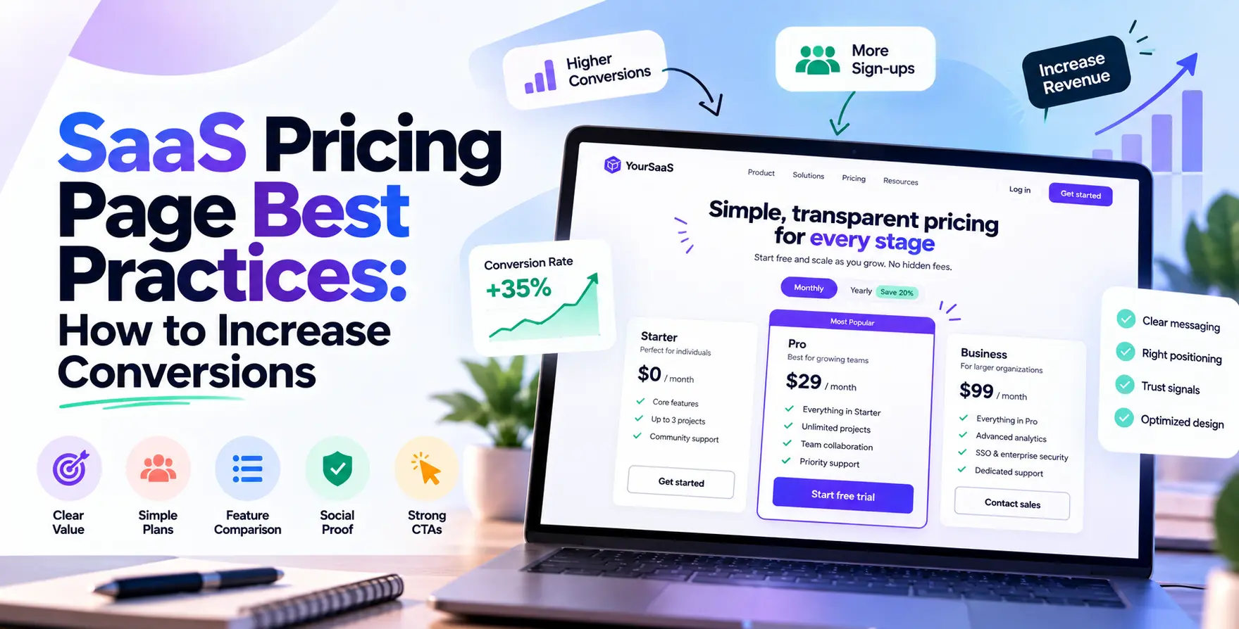
Your pricing page is often the most critical destination in your sales funnel. Visitors arriving here have already expressed interest in your product, meaning they are ready to buy if the value proposition remains clear.
Optimizing this specific page can significantly impact your bottom line. By applying proven SaaS pricing page best practices, you can ensure that potential users feel confident in their purchase decision.
The Psychology of Choice
When users face too many options, they often experience choice paralysis and leave without taking action. Keeping your plans limited helps potential customers make faster decisions.
Highlighting a specific tier as the most popular choice can act as a powerful nudge. This creates a sense of social validation for the undecided visitor.
- Limit choices to three main tiers
- Highlight the best value option
- Reduce cognitive load for visitors
- Focus on outcomes rather than features
Structuring Your Pricing Tiers
A effective SaaS pricing strategy relies on how well you categorize your features. You must align your tiers with the actual needs of your target user personas.
Basic Entry Tier
This tier should appeal to your most price-sensitive users. It provides enough functionality to get them started without overwhelming them with complexity.
- Low barrier to entry
- Limited but useful feature set
- Focus on core functionality
Professional Growth Tier
This is usually the sweet spot for your revenue. Most users will find themselves here, making it the most important tier to optimize through effective pricing page conversion optimization.
- Balanced feature set
- Scalable capacity limits
- Recommended for most teams
Enterprise Custom Tier
Large organizations have unique requirements that standard tiers cannot meet. Offering a contact option here signals that you can handle complex workflows.
- Custom integration support
- Dedicated account management
- Advanced security features
Visual Hierarchy and Design
Good design is essential for guiding the user’s eye toward your desired outcome. A cluttered layout will distract visitors and hurt your conversion rates.
Ensure that the most important information, such as price and core benefits, is easily scannable. Your typography and spacing should work together to create a clean, professional aesthetic.
- Use whitespace to separate tiers
- Employ clear, large font sizes
- Maintain consistent brand styling
- Ensure high contrast for buttons
The Role of Social Proof
Potential customers often look for reassurance before committing to a subscription. Including testimonials or logos of well-known clients builds trust immediately.
Displaying these elements near your pricing table can alleviate final-minute anxiety. When users see that others trust your platform, they are more likely to convert.
- Client logos and testimonials
- Trust badges for security
- Case study link snippets
- Number of current active users
Clear Call to Action Elements
Your call to action should stand out from every other element on the page. Use a contrasting color that aligns with your brand but remains visually distinct.
The text on your button should be action-oriented and benefit-driven. Avoid generic phrases like "Submit" in favor of something more engaging.
- Use high-contrast button colors
- Include clear, direct text
- Place buttons under each column
- Make the buttons large enough
Simplifying Your Pricing Strategy
Transparency is key to building lasting relationships with your customers. Avoid hidden fees that might shock users during the final checkout process.
If you offer a free trial, make sure the terms are clearly stated. Ambiguity on the pricing page is a leading cause of visitor drop-off.
Leveraging Annual vs Monthly Billing
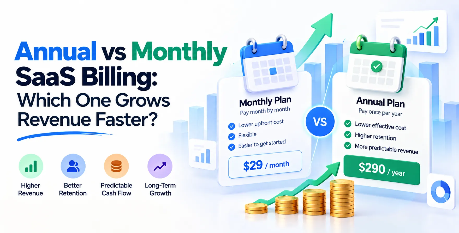
Offering both annual and monthly billing options allows you to capture different segments of your market. This is a standard approach within a robust SaaS pricing strategy.
By showing the annual savings upfront, you encourage users to opt for longer commitments. This helps stabilize your cash flow and reduces the need for constant customer acquisition efforts.
| Feature |
Monthly Billing |
Annual Billing |
| Flexibility |
High |
Low |
| Cost |
Higher |
Lower |
| Commitment |
Low |
High |
| Revenue Impact |
Predictable |
Upfront |
Optimizing for Different Customer Segments
Different users value different aspects of your software. Tailoring your messaging to emphasize these specific values increases the perceived worth of each tier.
Ensure your copy speaks directly to the pains of the user looking at that specific plan. A small startup cares about speed, while a corporate buyer cares about security and compliance.
- Address startup needs specifically
- Highlight corporate-grade security
- Tailor features to specific roles
- Use clear benefit-oriented language
Common Pricing Page Pitfalls
Even small errors can lead to significant losses in potential revenue. Many companies fail by making their pricing pages too complicated or hidden behind multiple clicks.
Ensure your page is accessible directly from your main navigation menu. If users have to search for your pricing, they will likely find a competitor instead.
- Hidden pricing information
- Overwhelming number of features
- Lack of clear differentiation
- Unprofessional design elements
- No clear path to purchase
Mobile Optimization Considerations
A significant portion of your traffic will likely arrive via mobile devices. If your pricing table breaks or becomes unreadable, you lose those conversions instantly.
Use responsive design techniques to ensure your pricing tiers stack vertically on smaller screens. Test this frequently to maintain a seamless experience across all platforms.
Testing Your Pricing Page
You should never assume your first design is your best. Use A/B testing to experiment with different headlines, button colors, and pricing structures.
Small adjustments can lead to massive gains over time. Base your changes on actual user behavior data rather than guesswork.
Final Thoughts
Your pricing page is a living document that should evolve with your business. By continuously applying SaaS pricing page best practices, you can ensure that you are maximizing your conversion potential.
Focus on clarity, trust, and user experience to drive sustainable growth. Remember that every visitor is a potential partner in your long-term success.


 In collaboration with