Table of Contents
- Introduction
- Defining a Design System
- Foundations of Your System
- Choosing Your Component Strategy
- The Role of UI Component Libraries
- Structure of a Scalable Library
- Design System Best Practices
- Maintaining Consistency
- Documentation Strategy
- Framework Considerations
- Testing and Quality Assurance
- Accessibility in Design Systems
- The Future of Scalable UI
- Conclusion
Introduction
Building a modern SaaS product requires more than just clean code. You need a unified language that connects your design and development teams to ensure consistent user experiences. A well-crafted library helps teams move faster and reduces the technical debt that often accumulates in large-scale applications.
Understanding how to build a SaaS design system and UI component library is essential for any engineering team aiming for long-term growth. When your components are standardized, your developers spend less time reinventing the wheel. This efficiency allows you to focus on product innovation rather than constant UI maintenance.
Defining a Design System
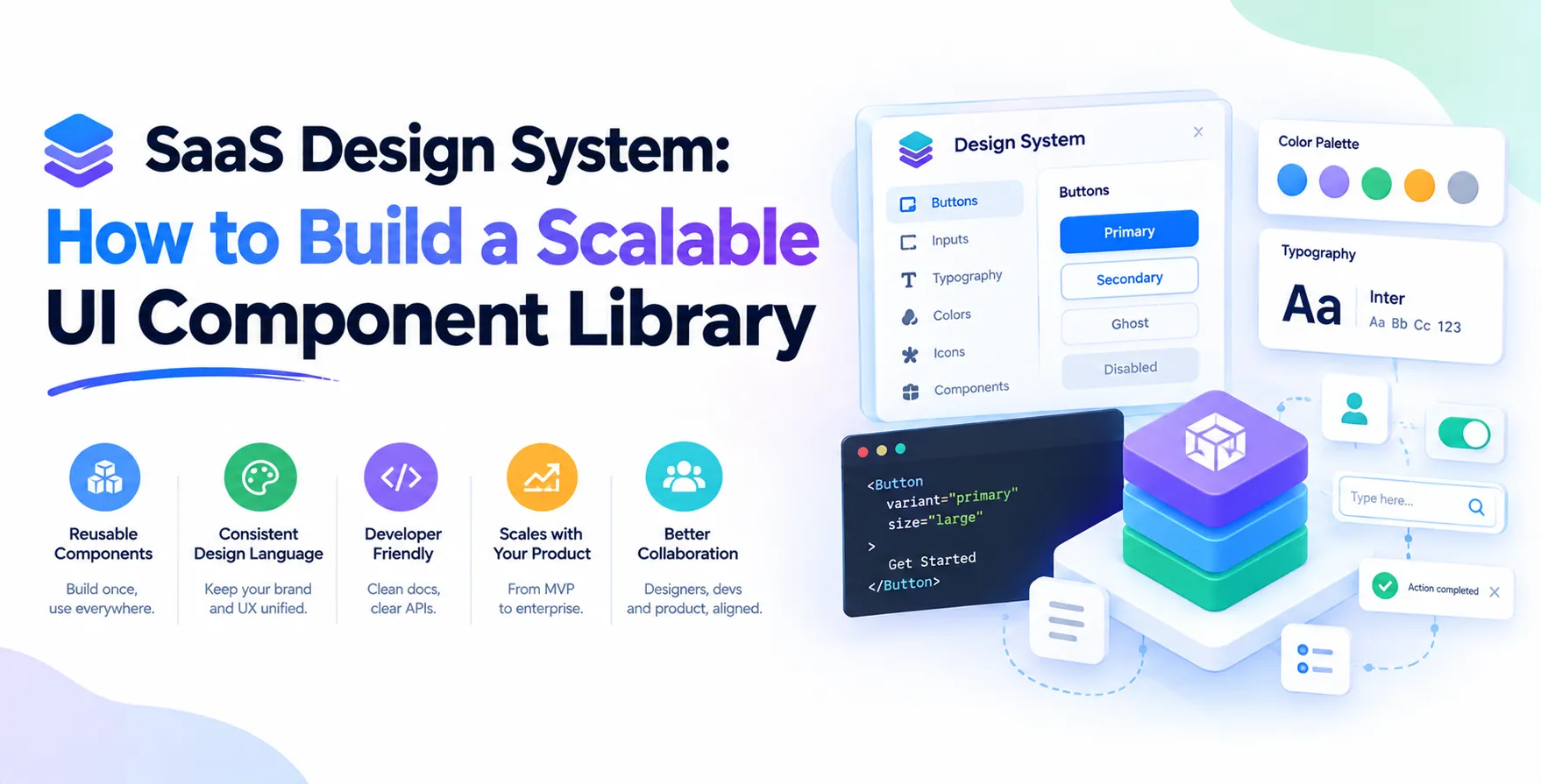
A design system is the single source of truth for your brand and product interface. It includes design tokens, reusable UI components, and clear documentation on how to use them. Without one, teams often find themselves shipping inconsistent experiences across different pages of the same application.
Think of it as a shared vocabulary between designers and developers. By aligning on specific patterns, you ensure that every button, form, and modal feels like part of the same ecosystem. This cohesion is the hallmark of professional software products.
- Centralizes design assets
- Standardizes UI patterns
- Improves developer productivity
- Ensures brand consistency
Foundations of Your System
Before you start coding components, you must establish your design tokens. These tokens represent the smallest units of your system, such as color palettes, typography scales, spacing, and border radiuses. By using tokens, you abstract away hard-coded values that become difficult to manage at scale.
When you update a token in your design system, the change propagates throughout the entire product. This eliminates the need for manual overrides in dozens of different CSS files. It is the most effective way to maintain a clean and scalable UI.
- Color variables
- Typography hierarchies
- Spacing systems
- Shadow and elevation levels
Choosing Your Component Strategy
Your component strategy determines how your team interacts with the library on a daily basis. You might choose to build everything from scratch or leverage existing libraries to speed up the process. A common approach involves creating a core foundation that wraps accessible primitive elements.
Regardless of the path, your primary goal is to ensure the UI component library is easy to consume. Developers should be able to drop a component into their feature branch and have it work immediately. If the library is too complex or rigid, they will simply build their own versions, defeating the purpose of the system.
Custom vs Prebuilt
You can choose to roll your own components or adopt an existing framework. Choosing the right path depends on your team size and specific product requirements.
- Custom components offer total control
- Prebuilt solutions save significant time
- Hybrid approaches balance speed and flexibility
- Maintenance overhead varies by path
Ultimately, the best design system best practices emphasize maintainability over short-term gains. You must consider how a component will hold up after two or three years of updates.
The Role of UI Component Libraries
A robust UI component library serves as the concrete implementation of your design system. It is where your tokens are turned into functional widgets like date pickers, dropdowns, and data tables. A well-organized library should be modular, allowing developers to import only what they need to keep bundle sizes small.
Version control is also critical here. You should treat your library like an internal product, complete with semantic versioning and clear release notes. This level of rigor prevents breaking changes from crashing production features when you update the core library.
Structure of a Scalable Library
Building a library that can handle hundreds of components requires a strict folder structure. You should group related items together to make navigation intuitive for new developers joining the team. Most teams find success by separating low-level primitives from high-level complex organisms.
Each component directory should contain the source code, tests, and documentation. When a developer needs to fix a bug or add a prop, they know exactly where to look. This structure reduces cognitive load and keeps the codebase manageable as the product grows.
- Core primitives
- Shared utility functions
- Complex layout containers
- Component-specific tests
Design System Best Practices
Adopting established design system best practices is the fastest way to avoid common pitfalls. For instance, you should always design components to be as stateless as possible. By keeping components pure, you make them significantly easier to test and reuse across different parts of the application.
Another vital practice is to enforce strict prop types or TypeScript interfaces. This provides immediate feedback to developers when they try to use a component incorrectly. High-quality tooling leads to high-quality code, which naturally results in a better final product for your end users.
Maintaining Consistency
Maintaining consistency across a large SaaS platform is a continuous effort. It requires regular communication between designers and developers to ensure the actual implementation matches the design files. When discrepancies arise, they should be addressed as bugs rather than accepted as technical debt.
You may consider a formal UI UX audit to catch inconsistencies that have slipped through the cracks. Periodic reviews help you identify areas where your documentation might be outdated or where components are being used in non-standard ways. Keeping your system in sync is just as important as building it in the first place.
Documentation Strategy
Even the most beautiful component is useless if no one knows how to use it. Your documentation should be living and interactive, allowing developers to toggle props and see the output in real-time. This reduces the number of questions being asked in internal communication channels.
Effective documentation includes more than just code snippets. It should explain the rationale behind a component, its accessibility considerations, and the specific use cases it covers. When you empower your team with clear guidance, you reduce the time they spend searching for answers.
- Interactive code playgrounds
- Clear usage guidelines
- Design rationale explanations
- Troubleshooting FAQs
Framework Considerations
The choice of framework often dictates the longevity of your design system. If you are building for a specific ecosystem like React, you should leverage its strengths, such as hooks and context for state management. However, keep in mind that the landscape is always shifting, and you may need to plan for future migrations.
Some teams are now exploring more modern approaches, such as building components that are framework agnostic. While this adds complexity, it ensures that your core design system remains relevant even if your frontend team decides to switch frameworks in the future. Always consider the long-term cost of your architectural decisions.
Testing and Quality Assurance
Quality assurance is the backbone of any reliable UI component library. You must implement automated testing, including unit tests for logic and visual regression tests for styling. If a color changes accidentally, your visual regression suite should catch it before it reaches your users.
End-to-end testing also plays a role in ensuring that components interact correctly with the rest of the application. By investing in these automated checks, you create a safety net that allows developers to refactor code with confidence. A library that is constantly breaking is a library that developers will stop using.
Accessibility in Design Systems
Accessibility is not a feature you add at the end; it is a fundamental requirement of modern UI development. Your components must follow established guidelines, such as WCAG, to ensure they work for all users, including those using assistive technologies. This includes proper keyboard navigation, ARIA labels, and logical focus management.
When your design system has accessibility baked into the base components, you ensure compliance by default. This is a huge win for your organization, as it prevents accessibility gaps from cropping up in new features. It also demonstrates a commitment to building inclusive software that everyone can use effectively.
The Future of Scalable UI
The field of frontend development is evolving rapidly, with new tools emerging to make design systems more efficient. We are seeing a move toward more automated workflows where design tokens are synced directly from design files to code repositories. This reduces human error and speeds up the handover process significantly.
As your team matures, you may explore advanced topics like theme-switching architectures or automated component discovery. Staying informed about the latest trends ensures that your system remains a competitive advantage rather than a burden. Always look for ways to simplify the lives of the developers and designers who rely on your work.
Conclusion
Building a design system is a journey that requires constant refinement and collaboration. By focusing on modularity, clear documentation, and accessibility, you create a foundation that supports your product's growth. A successful library is not just a collection of code but a cultural shift in how your team builds software.
Start small, iterate often, and always keep your end users in mind. Your investment in these standards will pay off through faster development cycles and a more cohesive product. Consistency and quality are the ultimate goals of any scalable UI architecture.
Frequently Asked Questions
- Question: How do I convince leadership to invest in a design system? Answer: Focus on the ROI of developer productivity and the reduction in design-to-development handover time.
- Question: Should I build a custom library or use an existing one? Answer: Use an existing library for speed if you are small, but consider custom components if you need deep branding control.
- Question: How often should I update the design system? Answer: Updates should be continuous but managed through a clear versioning strategy to prevent breaking user experiences.
- Question: What is the best way to handle design tokens? Answer: Use tools that allow for a single source of truth that can be exported to multiple formats like CSS, JSON, or SASS.
- Question: How do I ensure developers actually use the library? Answer: Make the library so easy to use that it becomes the path of least resistance for building new features.


 In collaboration with