Table of Contents
- Introduction
- Understanding Light Mode Mechanics
- Understanding Dark Mode Mechanics
- Dark Mode vs Light Mode
- Visual Acuity and Eye Strain
- Readability in Different Environments
- Impact of Astigmatism on Contrast
- Dark Mode Benefits for Battery Life
- Psychological Reactions to Color Schemes
- Accessibility Considerations
- User Preference Data and Trends
- UX Design Best Practices for Color Themes
- Conclusion
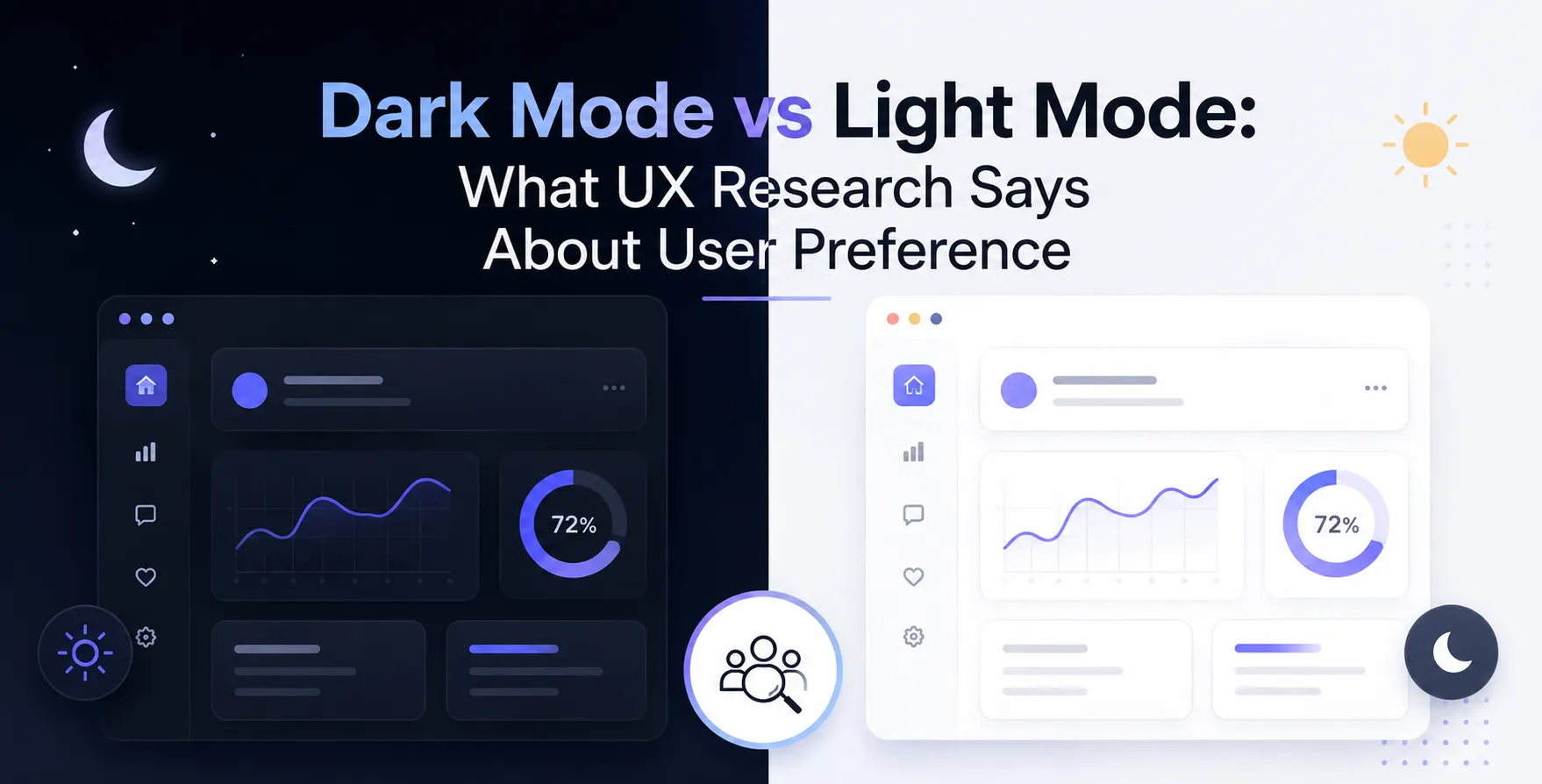
Choosing between light and dark themes is no longer just an aesthetic decision. Modern software design requires balancing visual appeal with user usability and health.
Understanding user preferences helps product teams build better digital experiences. Science provides clear guidance on how visual contrast affects reading and ocular fatigue.
Introduction
The choice between dark and light interfaces has sparked intense debate among designers and users alike. What started as a technical constraint in early computing has evolved into a central topic within modern User Experience Design.
Designers often disagree on which visual theme offers superior performance and daily comfort. Users frequently demand dark options, citing eye relief and aesthetic appeal.
However, empirical research reveals a far more complex reality. User preference does not always align with optimal visual performance or reading efficiency.
Understanding Light Mode Mechanics
Light mode uses dark text displayed on a bright background, effectively mimicking physical ink on paper. Human eyes evolved to perceive dark objects against illuminated light surfaces under natural daylight.
When viewing a bright display screen, the human eye pupil naturally constricts to regulate light intake. This pupil constriction sharpens depth of field and minimizes optical lens distortion.
Light backgrounds leverage fundamental human biology to optimize legibility and visual scanning efficiency.
- Improves character recognition speed
- Increases visual acuity in bright rooms
- Reduces pupil expansion effort
- Enhances legibility for dense text blocks
- Aligns with natural reading habits
Because of these optical mechanics, light backgrounds generally provide superior legibility for long text reading tasks.
Understanding Dark Mode Mechanics
Dark mode displays inverted visual contrast with bright text placed over a dark background surface. This presentation dramatically lowers total screen brightness emitted into the eye.
In low ambient lighting environments, reduced luminance prevents sudden eye shock and severe glare discomfort. Many users find this layout visually relaxing during evening computing sessions.
- Decreases overall screen light output
- Minimizes disturbance in low ambient light
Understanding these fundamental mechanics helps product teams evaluate Dark Mode Benefits across distinct user environments.
Dark Mode vs Light Mode
Comparing both display modes highlights key trade-offs in usability, legibility, and visual comfort. Examining Dark Mode vs Light Mode side by side clarifies optimal use cases for each interface style.
| Factor |
Light Mode |
Dark Mode |
| Best Ambient Light |
Daylight and bright rooms |
Dimly lit or night settings |
| Reading Speed |
Faster for long articles |
Slower for dense text |
| Visual Acuity |
Higher focus precision |
Lower focus precision |
| Eye Fatigue in Darkness |
Higher glare discomfort |
Lower glare discomfort |
| OLED Power Consumption |
Higher power draw |
Lower power draw |
| Astigmatism Comfort |
Higher comfort level |
Prone to halation effects |
Visual Acuity and Eye Strain
Visual acuity refers to the sharpness and clarity of human sight during specific viewing tasks. Studies show that bright backgrounds allow the eye pupil to narrow, increasing depth of focus.
Narrower pupils make character outlines sharper and significantly easier for the brain to process quickly. As a result, users proofread faster and make fewer scanning errors when working in light mode.
However, high display brightness in pitch-black surroundings causes intense contrast glare. This specific lighting imbalance triggers visual fatigue despite high acuity capability.
Readability in Different Environments
Environmental illumination drastically alters how human eyes experience digital screen displays. Sunlight washing over a screen makes dark interfaces difficult to read due to specular reflections.
Conversely, a bright white interface inside a dark room creates overwhelming glare. Matching interface themes to environmental lighting remains essential for long-term comfort.
- Light mode performs best in bright daylight
- Dark mode shines in low light spaces
- Outdoor sunlight favors high light luminance
- Automatic switching balances day and night usage
Impact of Astigmatism on Contrast
Astigmatism is a common vision condition caused by an irregularly shaped eyeball cornea or lens. Roughly one-third of the global population experiences some degree of astigmatism.
For users with astigmatism, white text on dark backgrounds causes a noticeable halo blur effect. Light bleeds past character boundaries, creating distorted text ghosts known as optical halation.
Consequently, light interfaces offer significantly better reading clarity and less visual strain for astigmatic individuals.
Dark Mode Benefits for Battery Life
Beyond visual ergonomics, screen display technology plays a major role in color scheme selection. OLED and AMOLED displays illuminate each pixel individually without requiring a backlight.
When rendering true black pixels, OLED screens turn off those specific display pixels completely. This hardware behavior creates direct power savings on portable mobile devices.
- Reduces battery drain on OLED screens
- Saves up to 60 percent display power
- Extends overall battery longevity
- Has zero power impact on LCD panels
- Lowers energy footprint during heavy use
- Maximizes device lifespan on mobile hardware
Psychological Reactions to Color Schemes
Interface colors influence emotional feel, brand identity, and user focus levels during digital interactions. Dark interfaces often convey modern elegance, luxury, and high-tech sophistication.
Light interfaces evoke feelings of cleanliness, clarity, trust, and traditional professionalism. Choosing the correct scheme shapes how users perceive brand reliability.
- Dark schemes feel sleek and premium
- Light schemes feel accessible and friendly
- Dark backgrounds highlight vivid image content
- Light backgrounds enhance text comprehension
Designers must align visual scheme choices with overall brand positioning and user needs.
Accessibility Considerations
Accessibility ensures modern digital products serve all individuals regardless of visual capability. Applying established guidelines guarantees equitable user experiences across desktop and mobile devices.
Color Contrast Ratios
Ensuring adequate contrast between text and background prevents visual strain for low-vision users.
- Meets standard contrast ratio guidelines
- Avoids pure black background backgrounds
Maintaining high contrast thresholds remains essential across both light and dark display modes.
User Control Options
Forcing a single color theme onto all users creates accessibility barriers and user frustration.
- Provides explicit theme selection switches
- Syncs interface defaults with operating system
- Remembers individual user theme choices
- Allows instant theme switching seamlessly
Empowering users with explicit interface choices aligns directly with visual accessibility standards.
User Preference Data and Trends
User preference surveys indicate that a majority of consumers prefer dark interfaces when given the option. Operating systems now include automated theme schedules as built-in standard functionality.
Despite user preference leaning toward dark themes, objective comprehension tests still favor light themes for reading tasks. Balancing user preference with reading efficiency requires careful consideration.
- Over 70 percent select dark themes daily
- Nighttime usage shows highest dark preference
- Developers prefer dark backgrounds for code
- Media apps benefit from dark interface framing
- Reading apps perform better in light schemes
UX Design Best Practices for Color Themes
Implementing successful interface themes requires adhering to core visual guidelines. Applying verified UX Design Best Practices ensures software remains legible, accessible, and comfortable.
Designers should avoid pure black and pure white combinations to prevent harsh visual vibration. Instead, use soft off-black greys and muted off-white tones to establish balanced contrast.
- Use dark grey instead of pitch black
- Desaturate accent colors for dark themes
- Maintain minimum contrast standards across themes
- Support system level light dark preferences
- Test interfaces across multiple lighting conditions
- Avoid pure white text on dark backgrounds
Following these structural guidelines delivers a polished visual experience that respects user physical comfort.
Conclusion
Neither light mode nor dark mode is superior in every operating situation. Visual research demonstrates that light mode offers higher legibility and reading speed, while dark mode reduces power consumption and glare in dim settings.
The most effective product strategy provides user choice rather than forcing a single static view. Allowing users to choose their preferred theme ensures maximum visual comfort and satisfaction across environments.
By applying empirical research to interface decisions, software developers can build digital products that look great while supporting visual health.


 In collaboration with